RT 4.2 adds the ability to chart several different aspects of ticket data at the same time with new grouping options. You can also chart various calculated values to get more from your time data.
As with earlier RT charts, the first step is to build a query to search for the tickets you want to chart. Your search might focus on a particular queue and you might only want to see tickets in a selected time period. Once you have your search and click on the Chart link from the submenu on the search results, you'll see new Group by and Calculate options below the initial default chart.
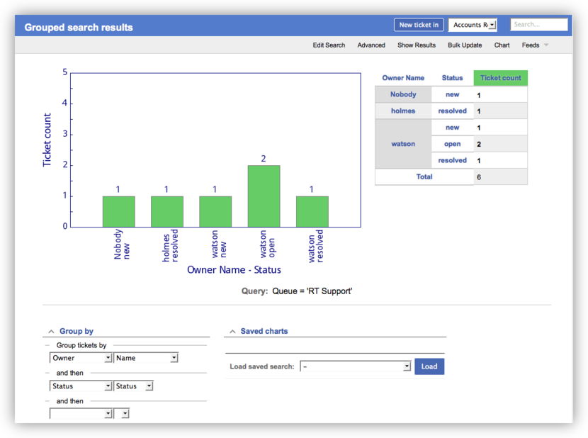
The Group by section allows you to define up to three levels of grouping to chart your ticket data. For example, you might want to see the owners of all of the tickets in your selected queue and how many tickets each owner has. To view that, you just select Owner in the first "Group tickets by" section. Depending on the view you want, you can have the owner label display using name, email address, real name, or some other user field.
As you're looking at that chart, you might wonder how many of those tickets are in each status. Are they mostly resolved, or are people juggling a bunch of open tickets? To see the status information, you can select Status from the next dropdown under "and then." That would give you a chart and table that looks something like this:

RT tickets have many date and time fields, some automatically set for you by RT like Created and Resolved, and some optionally set by you like Time Estimated and Time Worked. These fields can be helpful in determining where people are spending their time and how well tickets are moving. The new Calculate section on the Charts page makes it very easy to generate charts and tables from this data.
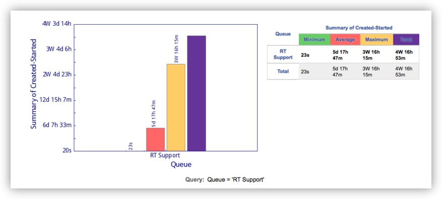
For example, you might want to see how long tickets are in the new status before someone has time to take and open them. You can get this value by looking at the difference between Created (when RT initially created the ticket based on a request) and Started (when the ticket was opened). On the Charts page, you can set the Group by section to only Queue. In the Calculate section you can select Created-Started, leaving the second dropdown set to the Summary option. When you click Update Chart you get a chart and table showing you the Minimum, Average, Maximum, and Total time tickets spent in the new status for the selected queue.

Like the Group by section, you can now also select multiple criteria in the Calculate section to display at once. So after seeing the time spent in new, you might also want to see how long tickets were active before being resolved. In the Calculate section you can use the second section below "and then" and select Started-Resolved and leave the initial Summary option. Clicking Update Chart you now have all the same values for the time the ticket was active.
While all of that information is interesting, you might decide the chart and table are a bit busy with all of those values. If you look in the second dropdown in the Calculate section, you'll see you can select each calculated value individually. You might want just Average for both values to get a general idea how long things are taking.
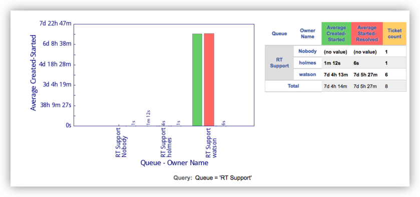
Pulling it all together, you can select Queue and Owner from the Group by section, and a combination of times and ticket count to generate a graph and table like the one below.

Adding the count mixes the units a bit and you can see that the chart units are set by the first calculate criteria (time in this case). But adding the count is a good way to give perspective to the averages. In this case it shows that while holmes' averages look good, he only worked on 1 ticket.
You'll find there a many new ways to mix and display your data to get more information from your ticket system. As always is the case, the better you follow your processes (taking, opening, resolving tickets) and track data (if you use the other time fields), the more useful the data will be. And once you create the charts you want, you can save them and create a convenient dashboard so you can easily check them.
You can read more about charts in the new charts section in the RT documentation. If you missed some earlier posts on the new features in RT 4.2, you can find more in the new feature overview.
